Neutral Wall Art
Abstract photography prints in beige, grey, white and brown
Neutral wall art doesn't have to mean bland. The palette on this page is sand and tobacco brown, fog grey, Lisbon limestone, bare-branch brown and the blue-grey of weather, all held at low saturation so a print changes with the light in the room instead of competing with it. The ten photographs are sorted from warm to cool so you can match one to the undertone of your room. Each is printed to order on fine art paper, aluminium dibond or acrylic, in sizes up to 100 × 150 cm, and shipped worldwide.
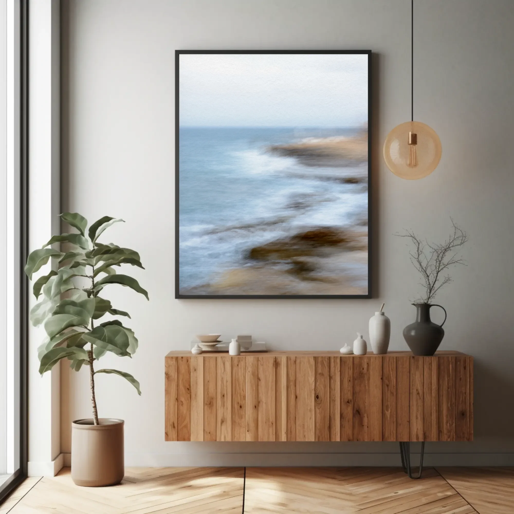
What counts as neutral in a photograph?
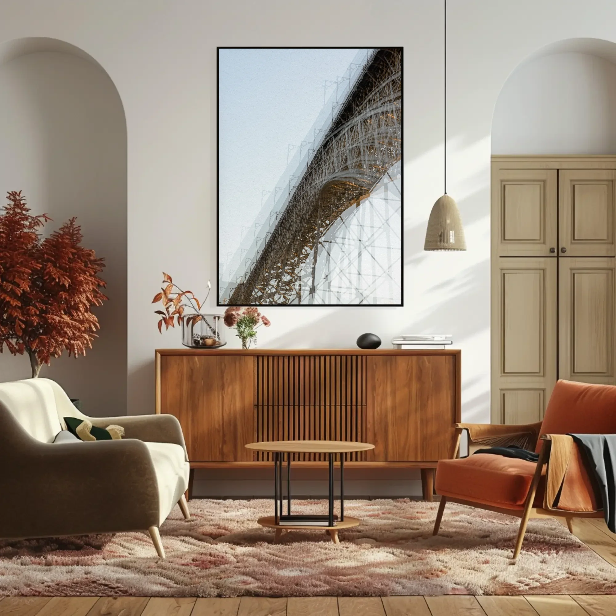
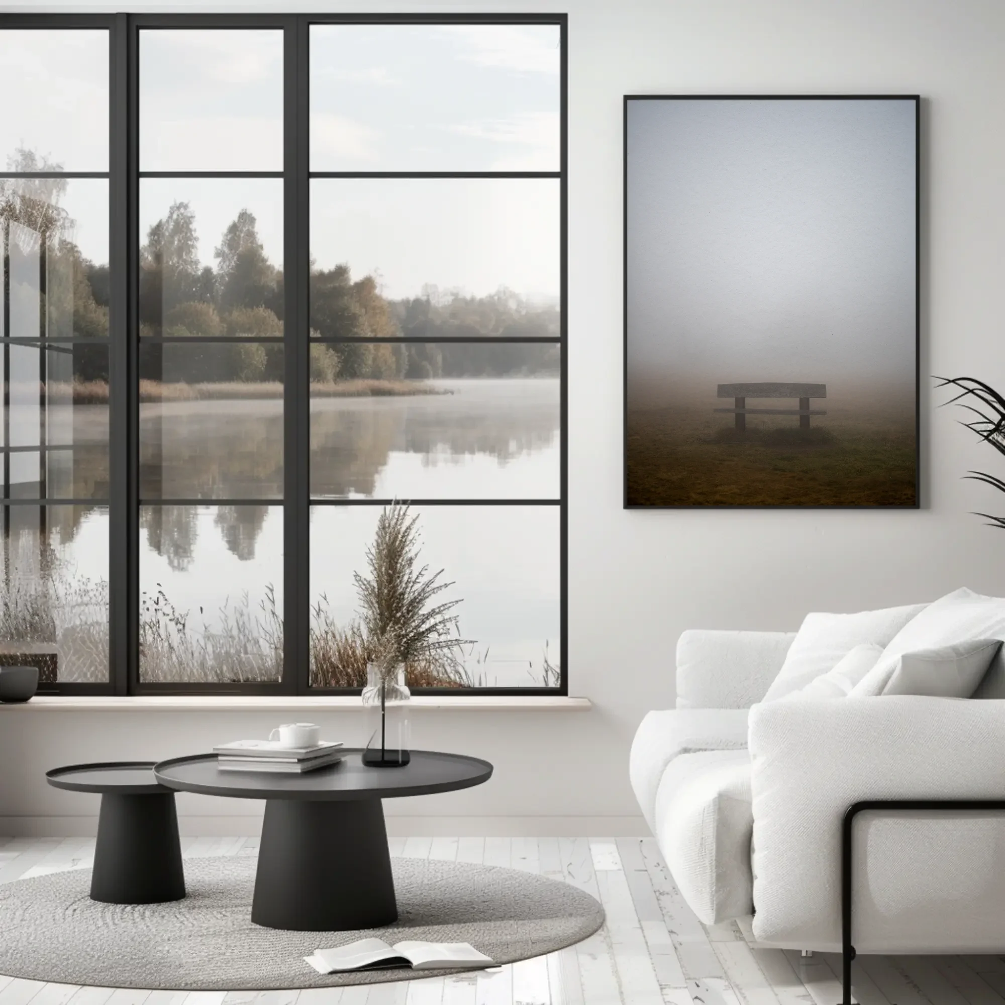
Paint companies sell neutral as a colour you choose. In a photograph it is a colour you find. The beige in Ponte is Lisbon limestone; the grey in Rest is Black Forest fog at seven in the morning; the brown in Without Roots is a bare tree in an Augsburg winter. None of these were adjusted towards a palette. They are what the materials looked like in that light, and materials are almost always quieter than the colours we pick for them.
The way I photograph does the rest. Most of these images were made with the camera moving during a long exposure, or with several exposures laid on one frame. Movement blurs saturation into tone: a red roof and a grey wall, dragged across each other, become a warm grey. What survives is the temperature of the light rather than the colour of any object, which is why neutral abstract wall art made this way sits in a room the way plaster or linen does, as a surface rather than a picture of something.
Warm or cool neutral wall art: matching the undertone of your room
Every neutral leans one way. Oak, walnut, terracotta, brass, unbleached linen and most plaster run warm. Concrete, steel, white-painted brick, pale ash and cool greys run cool. A room usually has a majority, and a neutral print either agrees with it or argues.
Agreeing is the safe choice and often the right one: a warm print in a warm room disappears into the wall and deepens it, which is what most people mean when they say a picture "goes". Arguing is the more interesting choice, and it only works with restraint. One cool print, Regung II or Surcando, in a room of oak and linen reads as a window onto weather. Two would read as a mistake. The grid below is ordered so you can find your side: the first three prints are warm, the last four are cool, and the three in between hold both temperatures and go either way.
Ten neutral prints, from warm beige to cool grey
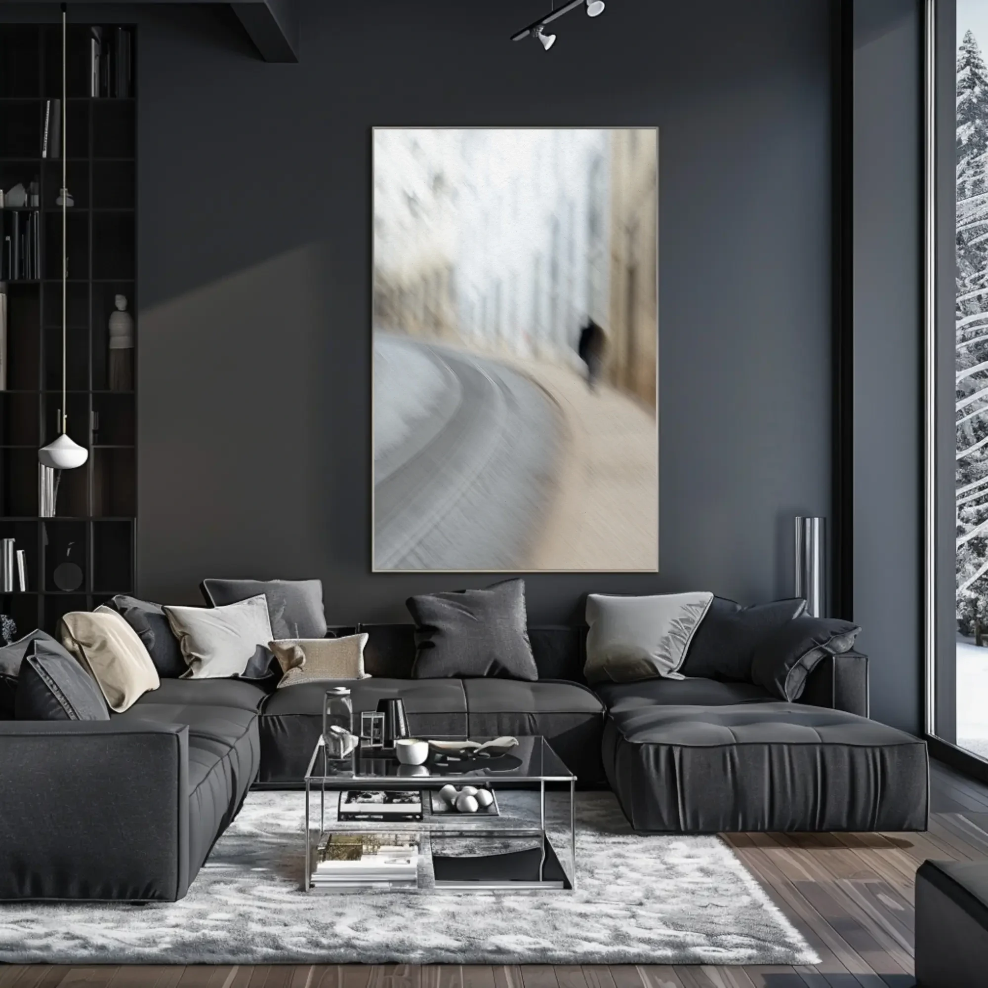
Each links to its own page with the full story, the palette and prices by size. The mockups show the print in a living room, bedroom or study so you can judge the scale.
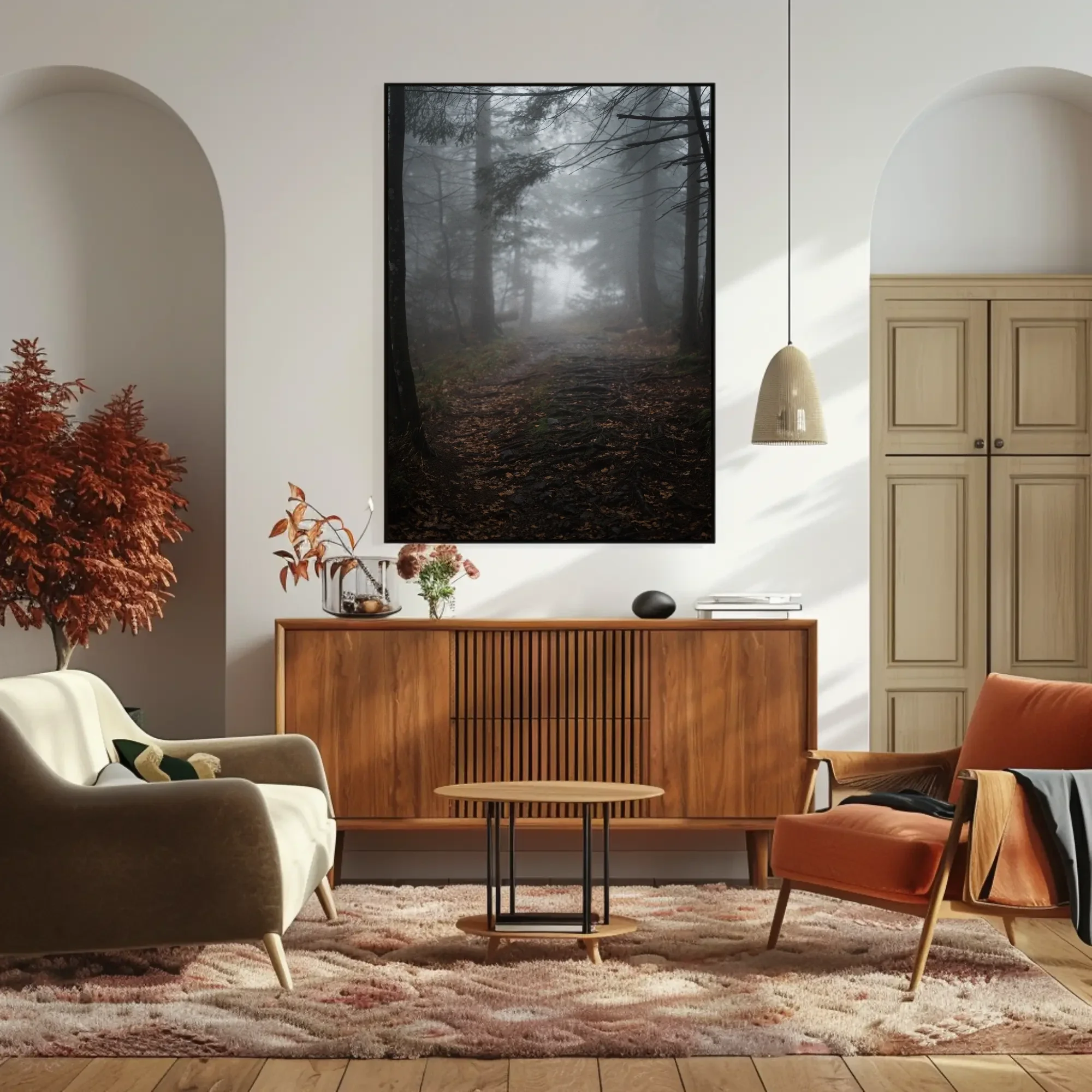
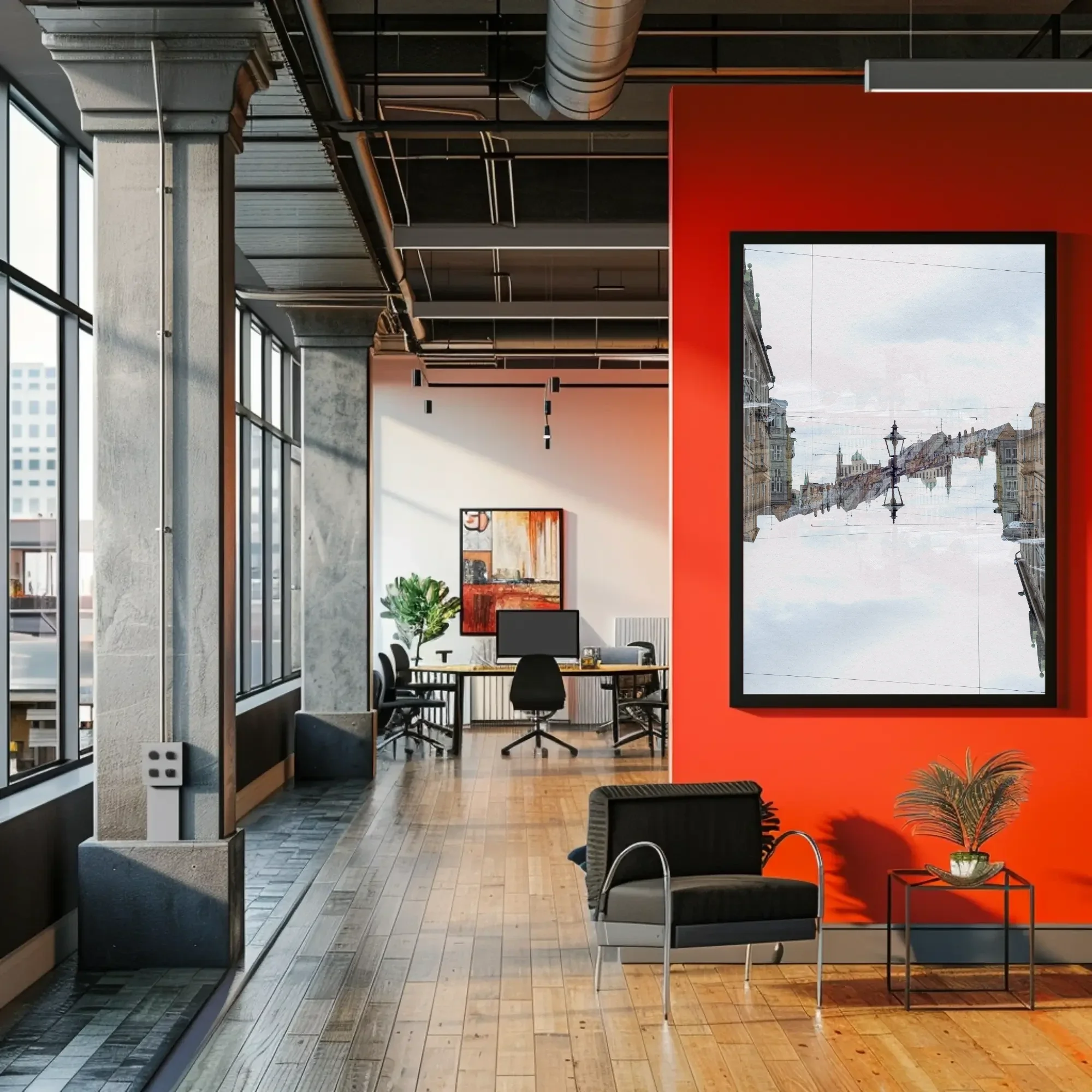
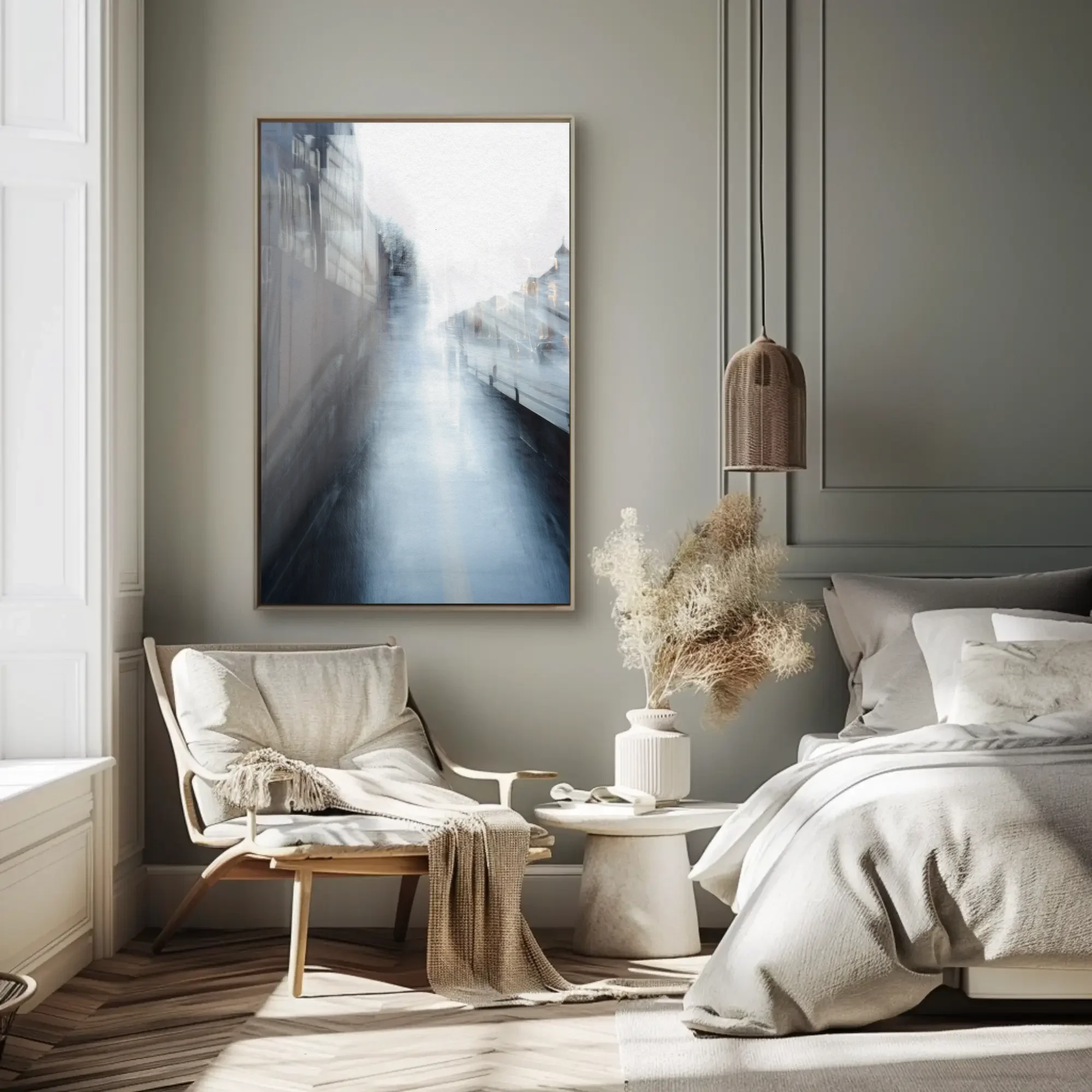
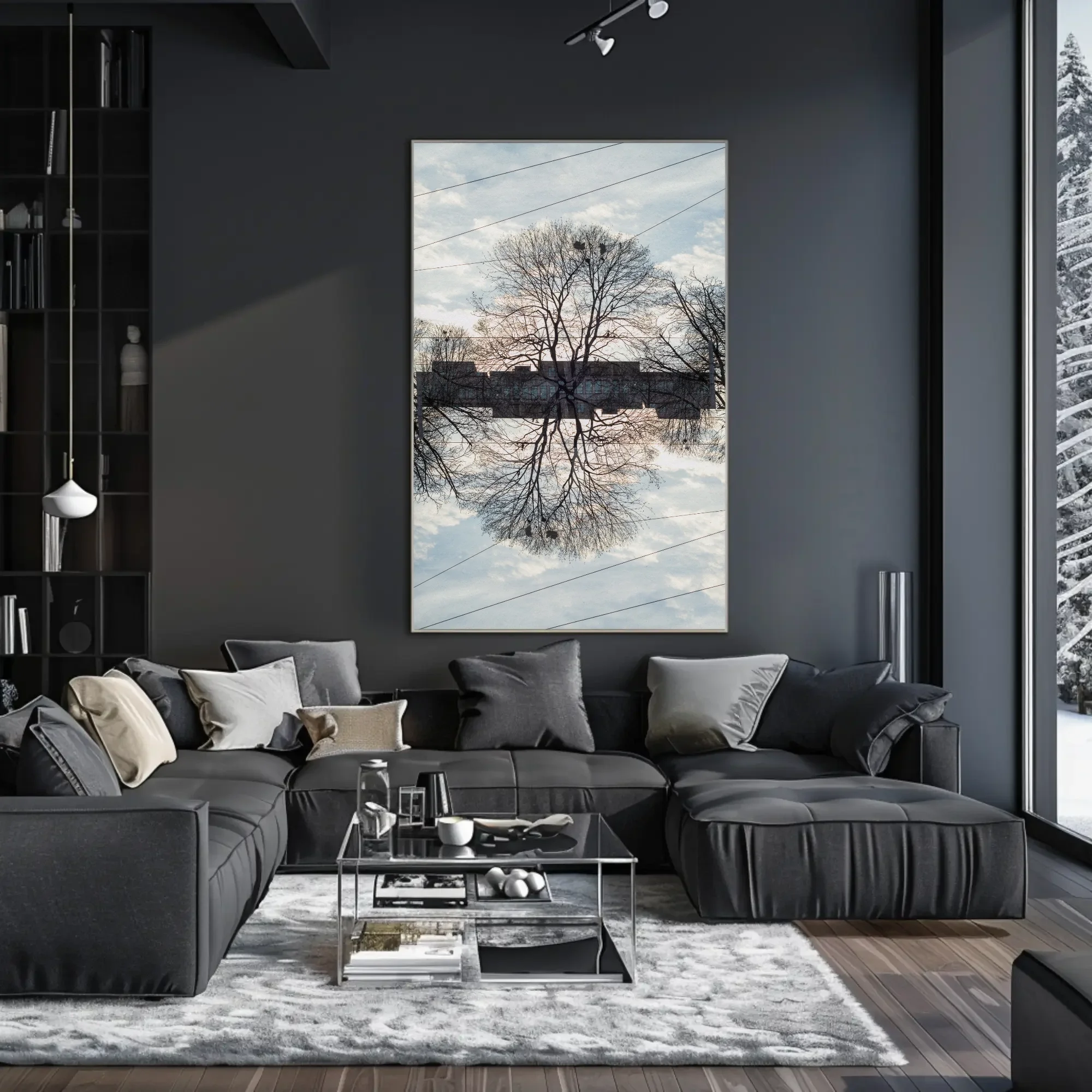
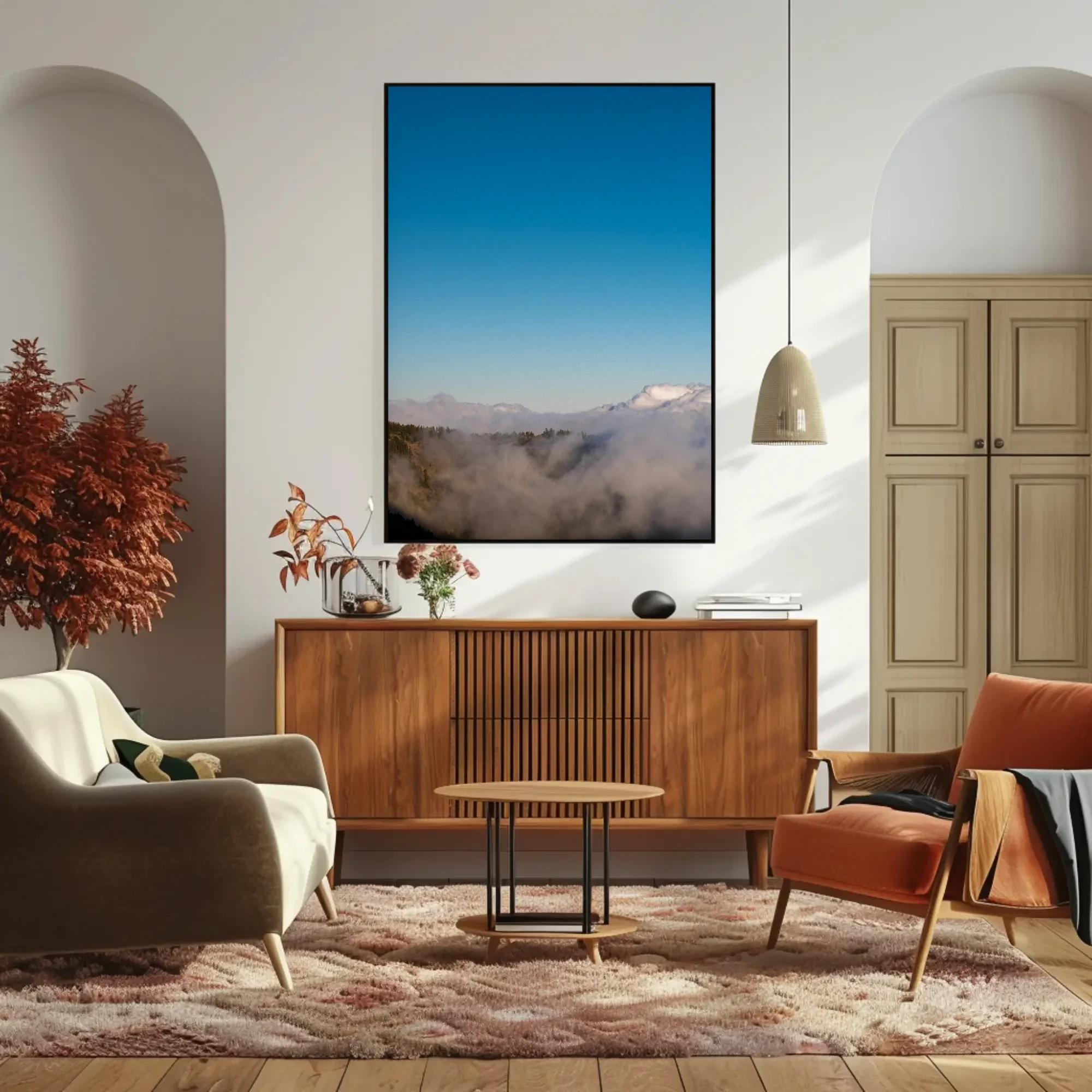
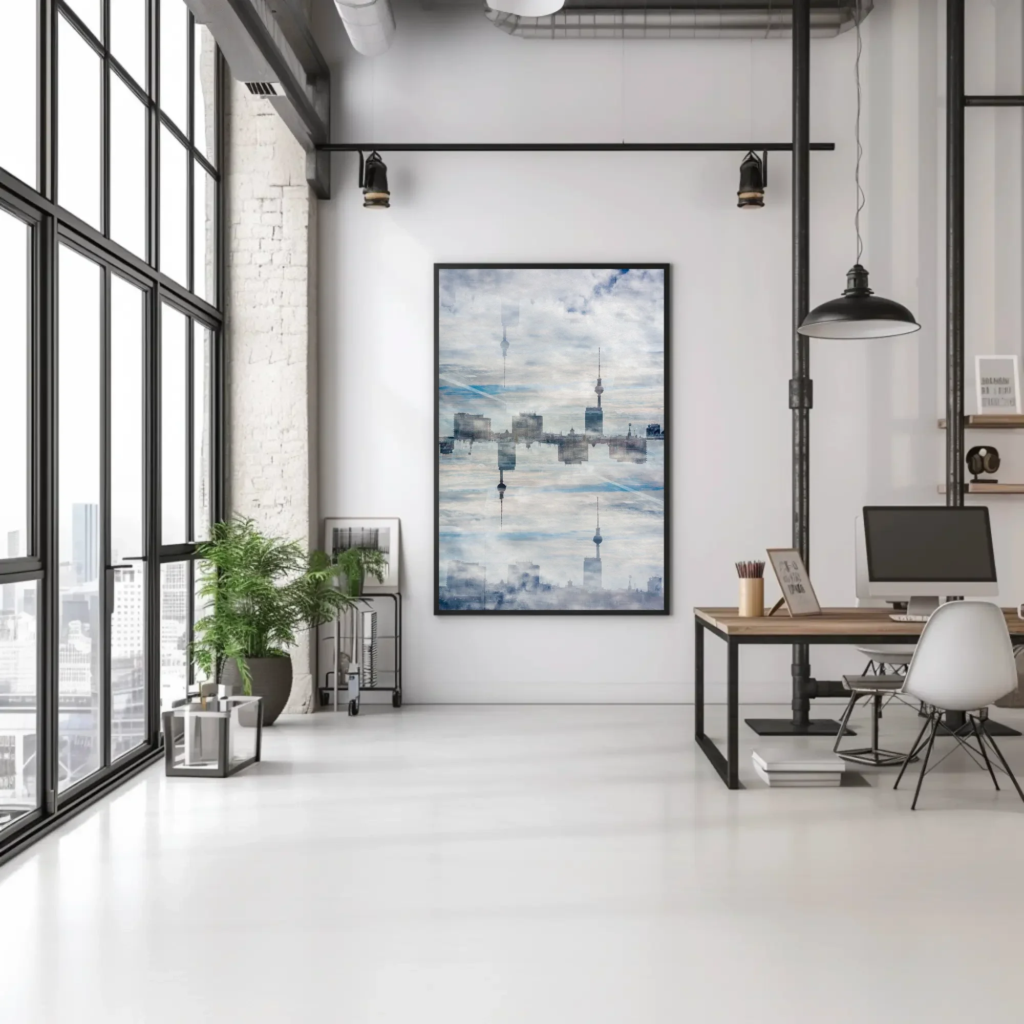
Neutral wall art for a living room
The living room is where a neutral print earns its keep, because the wall above a sofa is the biggest surface in the house that people actually look at. A colourful print there sets the room's mood on its own; a neutral one hands that job to the furniture and the light, and changes with them through the day. Rest above a grey sofa is fog in the morning and warm stone by lamplight.
Two things matter more here than anywhere else. The first is scale, covered below. The second is that the print should be the quietest large thing on the wall and the most detailed. A neutral print next to patterned cushions and a busy rug still works if there is depth inside the image to rest on. Ponte's layered arches and Without Roots's mirrored tree both do that; they hold up to a second and third look without adding colour to a room that already has enough.
Large neutral wall art: why size matters more when colour is quiet
A saturated print announces itself at any size. A neutral one has to earn attention with surface, and surface needs area. The most common mistake I see with quiet prints is hanging them too small, where they read as a gap in the wall rather than a picture. Go one size larger than your first instinct.
Above a three-seater sofa, that means 100 × 150 cm, or a pair of 80 × 120 cm prints. Above a two-seater or a sideboard, 80 × 120 cm. On the wall you face from a desk or an armchair, 60 × 90 cm holds its own. All of the prints here are available up to 100 × 150 cm, and the lightness of the cool ones, Von Allem Etwas in particular, is what keeps a print that big from crowding a room. The print sizes guide lists every format in centimetres and inches.
Paper or dibond for a neutral print?
Gloss fights a quiet palette. An acrylic face-mount adds depth to strong colour, but on a beige and grey image it mostly adds reflections, and the room's windows end up on the print. For a neutral piece I would choose fine art paper, matte and framed by a local framer behind museum glass, or aluminium dibond, which sits flat to the wall with a satin surface and no frame. Paper is the warmer of the two; the slight texture of Hahnemühle Photo Rag suits fog and stone. Dibond is the cooler, and it suits the architectural prints, Regung II and Von Allem Etwas, where a clean edge belongs to the image. Both ship unframed, and shipping is included on paper.
Beige, black and white, and size: neutral wall art questions
What is the difference between neutral and beige wall art?
Beige is one colour. Neutral is a range of low-saturation colours, from warm sand and brown through grey to cool white, and a neutral print usually holds several of them. A print that is only beige can look flat next to a beige sofa. A neutral print with grey and white in it gives the sofa something to sit against.
Does neutral wall art look boring?
Flat neutral art does. What keeps a quiet palette alive is texture and depth inside the image: fog with distance in it, layered arches, a tree mirrored on itself. The prints on this page were made with the camera moving or with several exposures on one frame, so the tones shift across the surface instead of sitting in blocks.
Is black and white photography the same as neutral wall art?
Not quite. Black and white removes colour altogether and tends to read as graphic and high-contrast. Neutral prints keep colour at low saturation: the beige of stone, the brown of bark, the blue-grey of fog. They warm or cool a room in a way a monochrome print cannot. Figura, with its one black figure on warm white, sits closest to the border between the two.
What size should a neutral print be?
Larger than you would choose for a colourful one. A quiet palette does not announce itself, so a small neutral print can vanish on a big wall. Above a sofa, aim for two-thirds of the sofa's width, which means 100 × 150 cm over a standard three-seater or 80 × 120 cm over a two-seater. In a smaller room, 60 × 90 cm holds its own.
Do you ship to the United States and the UK?
Yes, worldwide. Shipping is included on fine art paper prints; dibond and acrylic are quoted for your address. Production and delivery take two to four weeks. Every print is made to order: choose a size and presentation on the print page, send the inquiry, and I reply with a delivery time and payment details.
Living room, bedroom and minimalist guides, beige prints and prices
I'm Markus H. Green, a photographer based in Nice. I make abstract and minimalist photographs of sea, sky, fog and cities, mostly with the camera moving, and print them to order on paper, dibond and acrylic. There is no shop on this site. I answer every inquiry myself, and I'm glad to talk through a specific wall before you order. More about the work, or get in touch.