Living Room Wall Art
Photography prints for the wall the whole room faces
The living room wall is the one everybody looks at, so whatever hangs there has to hold up for years. The nine photographs on this page are examples of prints that suit a wall above a sofa or a sideboard. Below is how wide to go, how high to hang, and which finish survives a room with the lamps on. I print each one to order on paper, aluminium dibond or acrylic, up to 100 × 150 cm, and ship worldwide.
What makes art for a living room different from art for a bedroom?
A bedroom picture only has to work at night, from a pillow. A living room picture works all day. People look at it while they talk, glance at it when they stop listening, and end up with it in the background of every photo taken at a party. Morning light comes from the window and evening light from a lamp beside the sofa, and the picture has to look right in both.
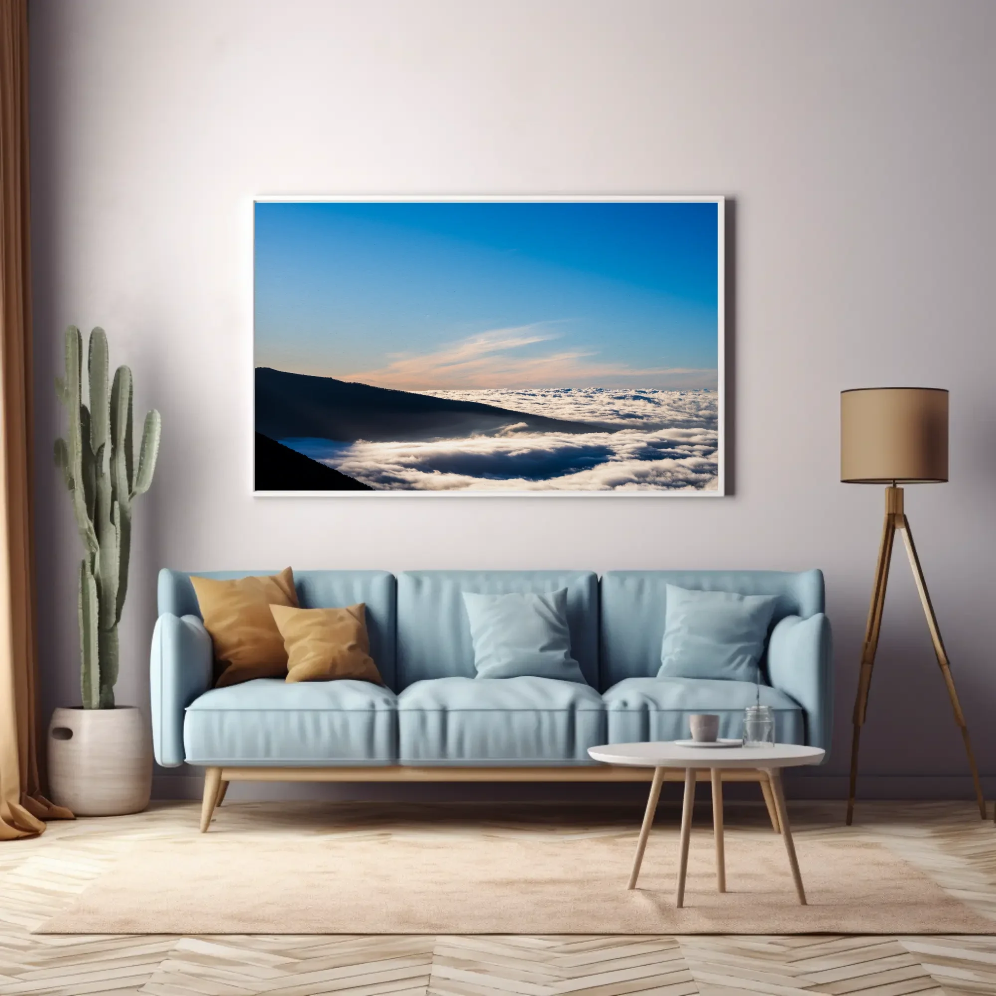
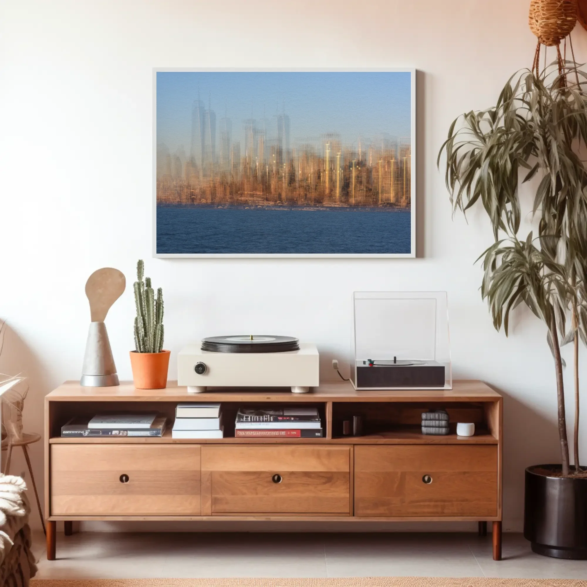
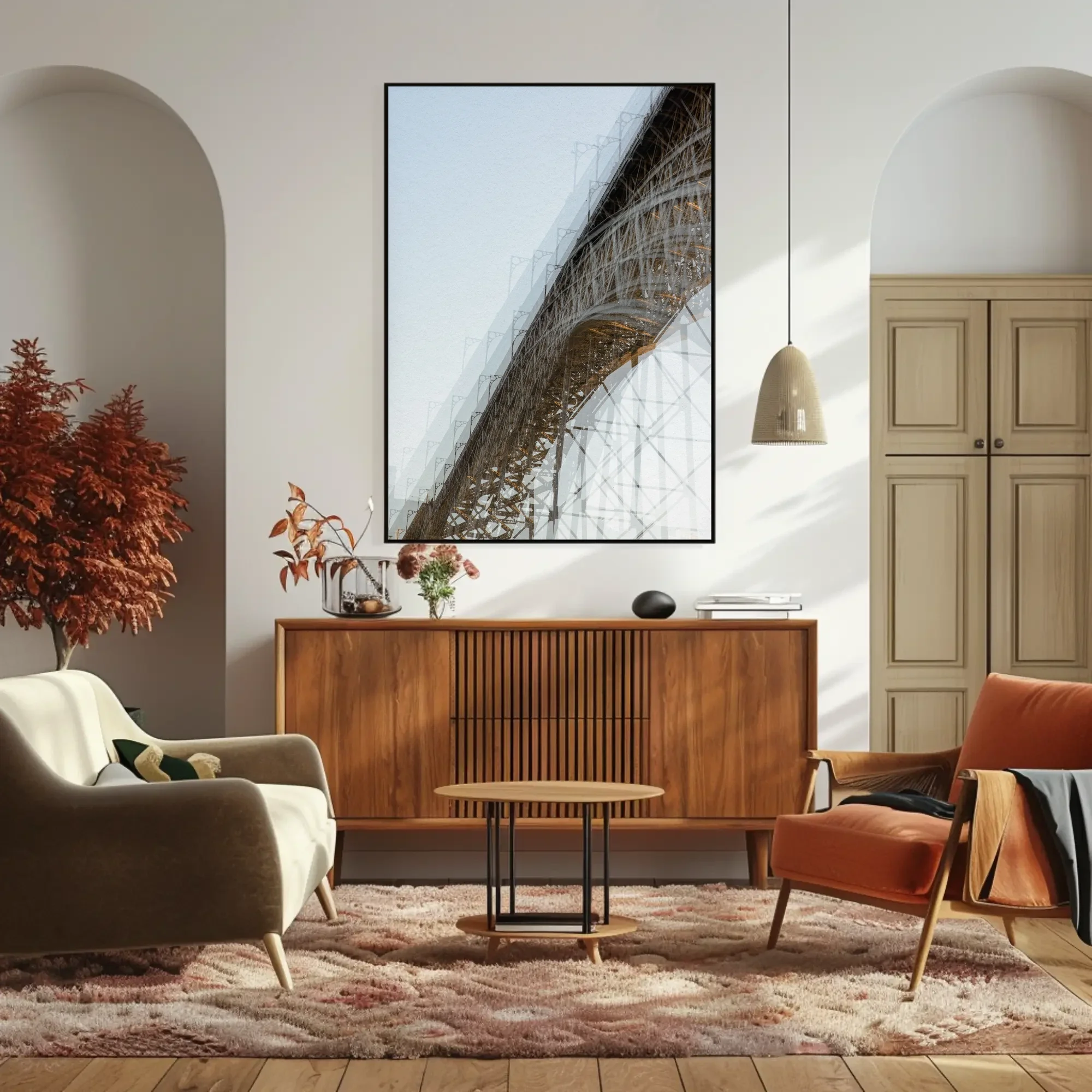
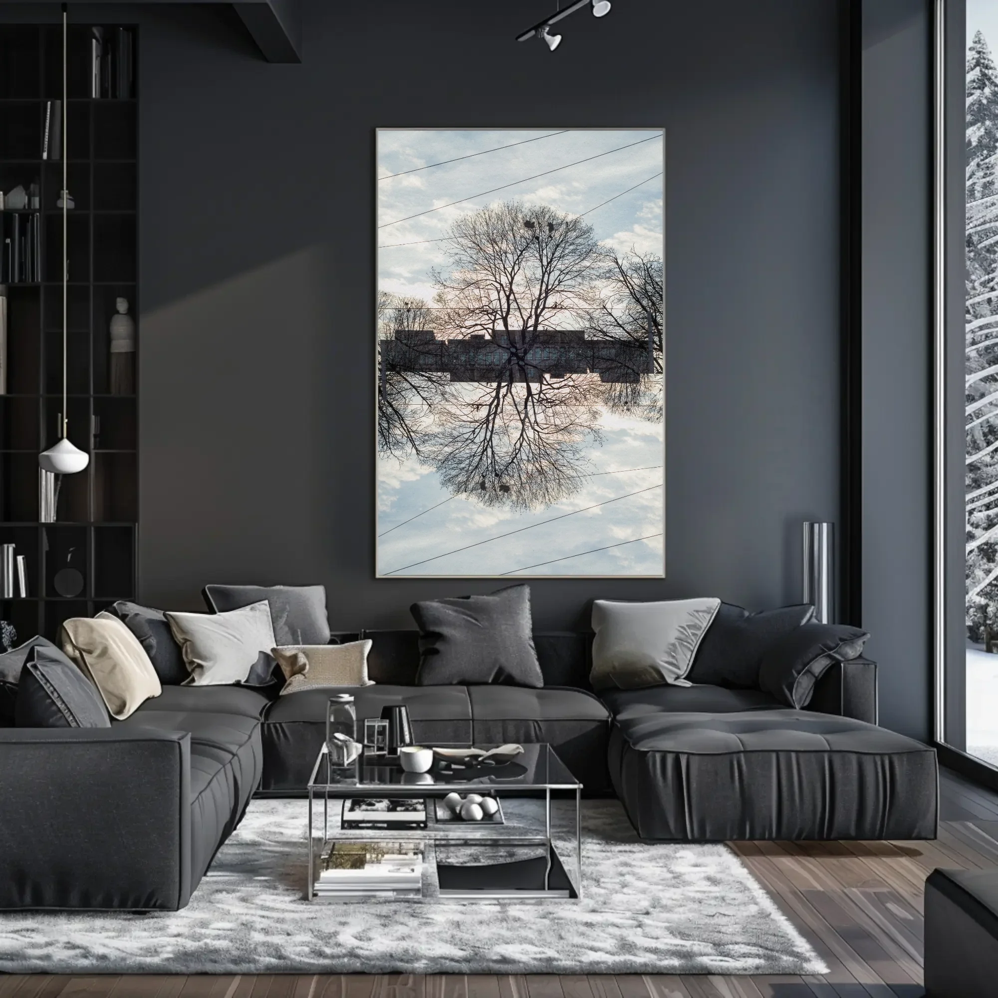
That rules out anything you can take in at a glance. A picture that gives itself up in a week gets used up in a week. These nine change the longer you look. El Teide I is a mountain ridge at first. After a while it becomes the feeling of standing above the clouds, an escape without going anywhere, with the cloud as a layer between you and whatever is going on below. NNYY I looks like the Manhattan skyline until you notice the layers: two cities laid over each other, streets and towers running into one another the way they do when you are in the middle of it. It is a picture of how many lives a city holds at once, and of how they connect. Without Roots is a tree with a building showing through it. They are not loud. They just do not run out.
How wide should the print above a sofa or sideboard be, and how high do I hang it?
Measure the sofa, not the wall. A print above a sofa looks right at two-thirds to three-quarters of the sofa's width. For a 200 cm three-seater that means 130 to 150 cm of picture, which is my 100 × 150 cm format hung on its side, or two 80 × 120 cm prints with a hand's width between them. A 160 cm two-seater takes one 120 × 80. Do not rule out 60 × 90 either: on paper, inside a mat and a frame, it hangs at about 80 × 110 cm, which is enough for a two-seater and a sensible starting point above a sideboard. Go narrower than half the sofa and the print looks like it was hung for a different piece of furniture. That is the most common mistake, and the easiest to avoid.
Then the height. Leave 15 to 25 cm between the top of the sofa back and the bottom of the print. Most sofa backs are 80 to 90 cm high, so the middle of a 100 cm tall print lands at about 150 cm, which is eye level when you stand and an easy glance up when you sit. Go higher and the picture starts to belong to the ceiling instead of the sofa.
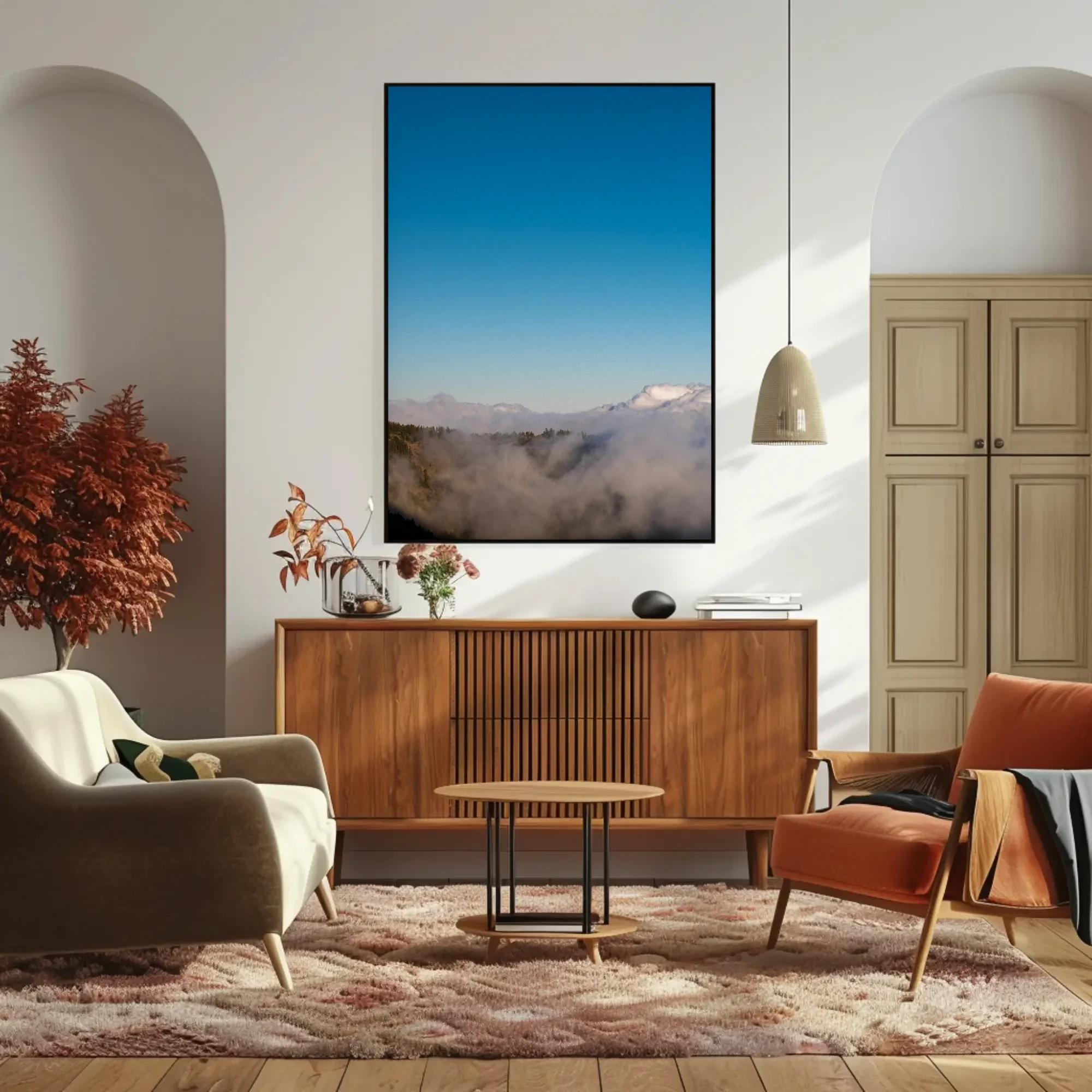
A sideboard follows the same width rule but not the same height rule, because nobody sits at a sideboard. You stand at it or walk past it, so the middle of the print goes to standing eye level, 145 to 150 cm, with 20 to 30 cm of wall above the surface so a lamp or a pile of books can live underneath without touching the frame. This is where the portrait formats belong. A 180 cm sideboard takes one 80 × 120 cm print in the middle, or a 100 × 150 hung tall if the ceiling allows. A drinks cabinet or a bar works the same way: narrow furniture, standing viewer, one tall print where a mirror would usually go.
Orientation follows the furniture. A sofa is long and low, and a horizontal print carries that line along the wall, which is why the three landscape formats come first below. A horizontal print also makes a narrow room feel wider, for the same reason.
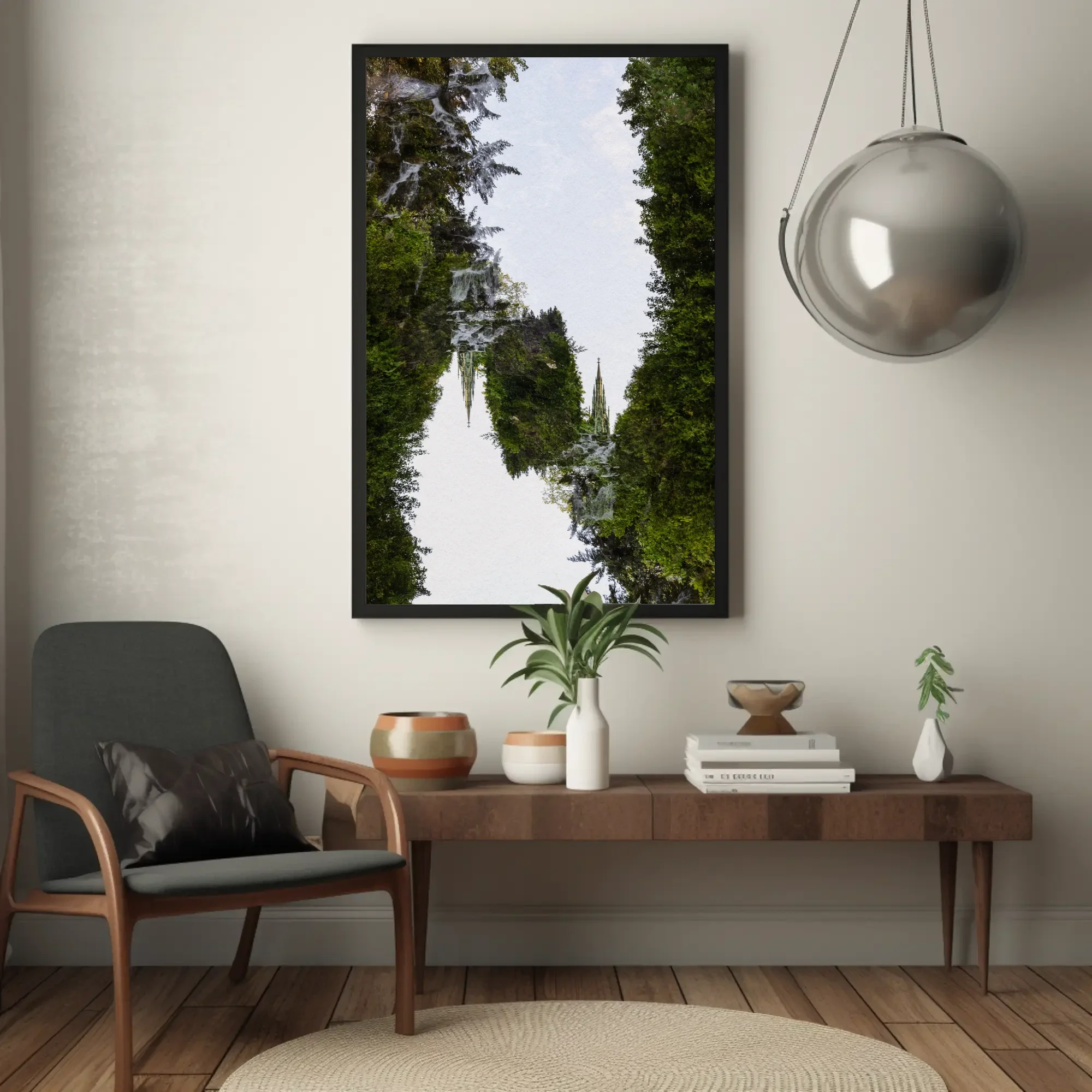
A vertical print does the opposite, and that is useful more often than people think. The strip of wall between a window and the corner, or between two doors, usually stays empty because nothing horizontal fits. A portrait print at 60 × 90 or 80 × 120 cm fills it, and the room stops looking like it has a gap. The same goes for any spot the room has already framed: between two arches, between a pair of plants, in the gap between a bookcase and a pillar. A tall print inside a frame the room made for it looks placed rather than hung. And a vertical print pulls the eye upward. Under a low ceiling, hang a portrait print with its top edge closer to the ceiling than you normally would, and the ceiling reads higher than it is. Ponte and Regung V are the two to reach for here. Every size is listed in centimetres and inches in the print sizes guide. If you are not sure, send me a photo of the wall with the sofa in it and I will tell you what I would hang.
| Above | Print that fits | Hang it |
|---|---|---|
| Two-seater sofa, about 160 cm | One 120 × 80 cm, or a 60 × 90 cm matted and framed | 15 to 25 cm above the sofa back |
| Three-seater sofa, 200 to 220 cm | One 150 × 100 cm, or two 80 × 120 cm side by side | 15 to 25 cm above the sofa back |
| Sideboard, about 180 cm | One 60 × 90 cm matted and framed, one 80 × 120 cm portrait, or one 100 × 150 cm hung tall | Centre at 145 to 150 cm, 20 to 30 cm clear above the surface |
| Narrow wall, 80 to 120 cm wide | One 60 × 90 or 80 × 120 cm portrait | Centre at 145 to 150 cm, higher under a low ceiling |
| Drinks cabinet or bar | One 60 × 90 or 80 × 120 cm portrait | Centre at 145 to 150 cm |
Which of these prints belong in a living room?
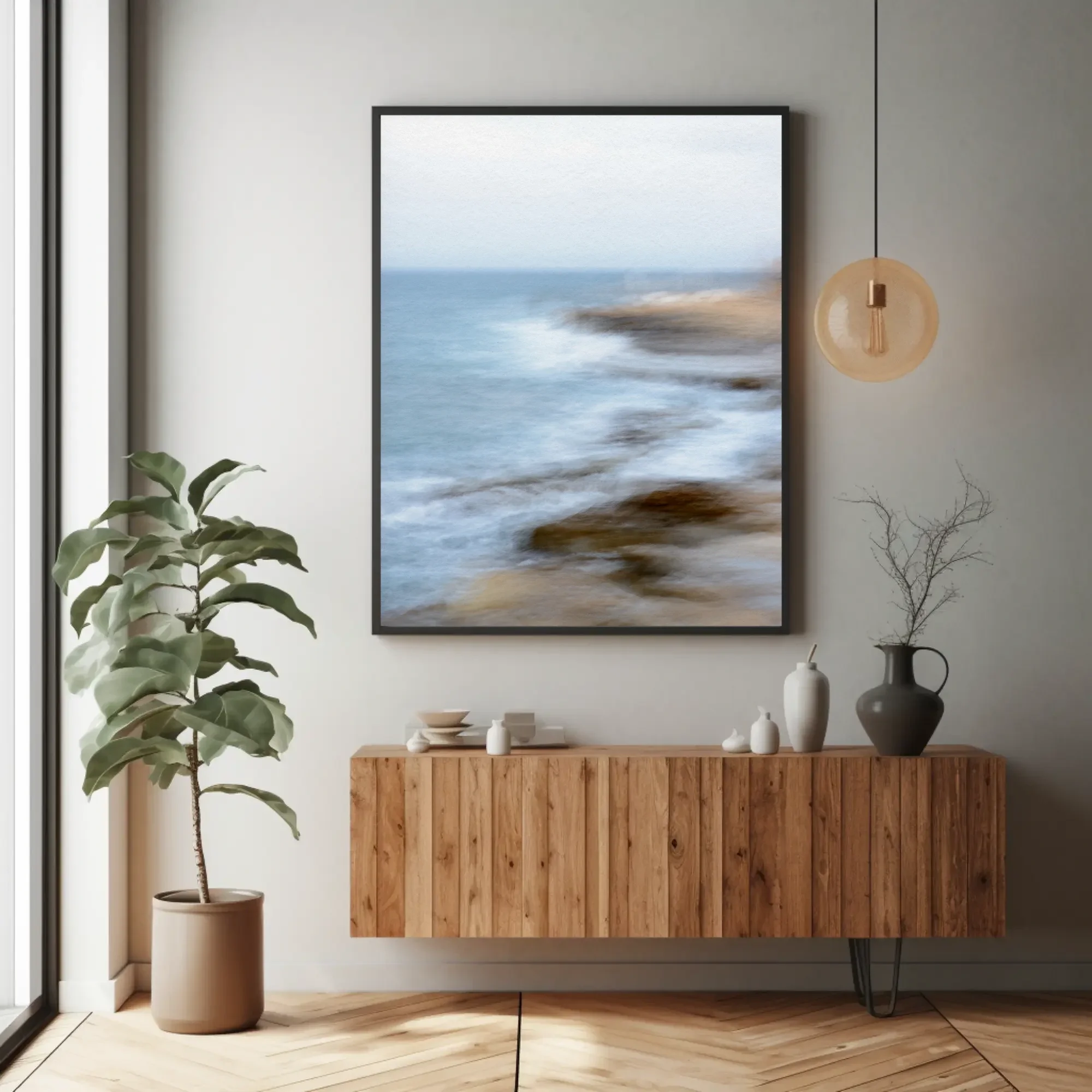
These are the pieces from the collection that suit a living room, with a line on why. The landscape formats come first because they fit above a sofa without any argument. Each one links to its own page with the story behind it, the palette, and prices by size. The mockups show each print above a sofa or a sideboard so you can judge the scale against the furniture.
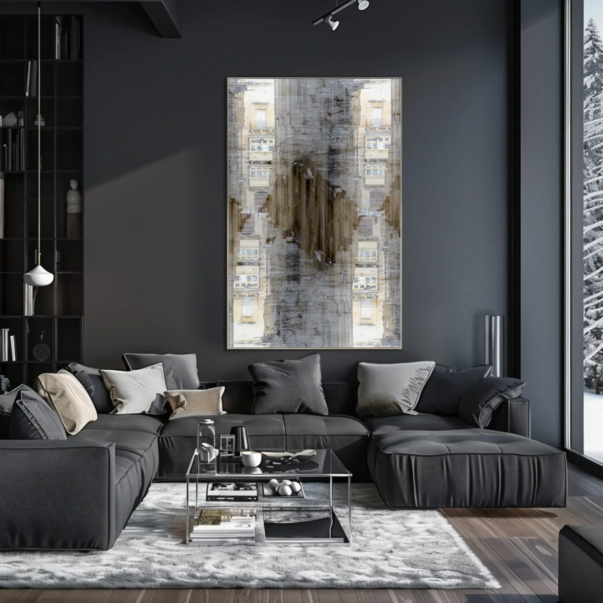
Should living room wall art stay neutral, or bring the colour?
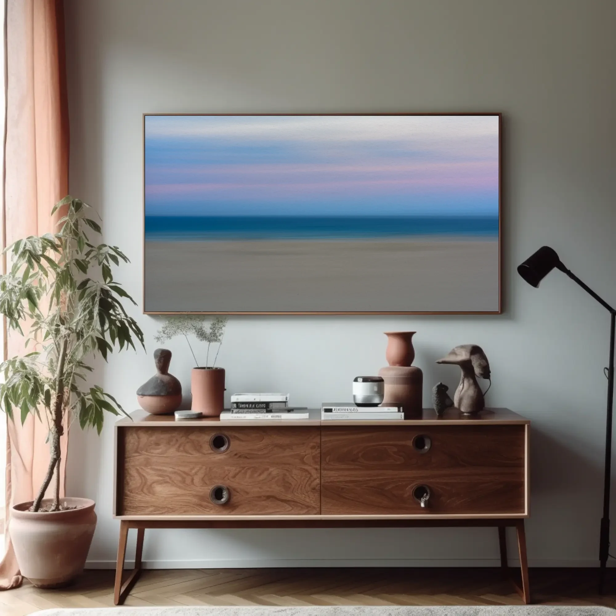
A living room has colour in it before you hang anything. The sofa has a colour, so does the rug, so do the spines of the books. That is the first difference from a bedroom, and it changes the advice. If the furniture is loud, let the print be the quiet one. Ponte, Regung V and Without Roots are beige, grey, white and brown, and they will sit above a green velvet sofa or a red rug without arguing with either. All three are also on the neutral wall art page, sorted by undertone.
If the room is pale, linen and oak and white walls, the print can bring the colour. El Teide I and Surcando are blue and white with a line of orange. In a warm room the blue reads deeper, in a cool grey room it stays light. NNYY I is the warmest thing here, dusk orange over blue, and it suits a room that is mostly used after dark, when the lamps bring the warm side forward. One rule covers both cases: match the print's undertone to the wood in the room, not the walls. You will repaint the walls long before you replace the oak table.
There are three ways a print can sit against the colours already in a room, and it helps to decide which one you want before you choose the image. It can fade in, picking up a colour the room already has, so that a beige and grey print above a grey sofa reads as part of the wall. It can sit next door, a blue print in a green room or a sand-coloured print against terracotta, where the colours are neighbours and the print looks like it grew there. Or it can push back. Blue and orange are the pair that does this best, because they sit opposite each other, and each makes the other look more like itself. A blue sofa with mustard cushions under El Teide I is that pairing in one room: the sky matches the sofa and the cloud picks up the cushions. NNYY I carries both colours inside the image, dusk orange over blue water, which is why it works in a blue room and in a rust one. Fading in is the safest. Contrast is the one people remember.
Which finish holds up above a sofa: paper, dibond or acrylic?
Above a sofa I would choose dibond first. A living room gets lived in. Someone leans on the wall behind the sofa, someone throws a cushion, the furniture gets shoved aside for a party. Aluminium dibond has no glass to break and no frame to chip. It sits flat against the wall with a satin surface, and even at 100 × 150 cm it is light enough to hang from two screws. It also copes with the mixed light of a living room, because it does not reflect the floor lamp or catch the sun from the window at four in the afternoon.
Fine art paper behind museum glass, framed by a local framer, suits a room furnished in wood and fabric, where the frame is one more piece of furniture. It is the quietest presentation, and the matte surface flatters the softer images, Raya and Regung V especially. Acrylic gives the deepest colour of the three, and El Teide I and NNYY I look their best in it, but it is a glossy sheet, so hang it on the wall facing the window, lit from the side, and not on the wall the lamps point at. All three ship unframed.
Should I hang one large print above the sofa, or a pair?
One large horizontal print is the better answer above a three-seater. The sofa is one shape, and one wide image answers it. This is where the 100 × 150 cm format earns its price: at that size El Teide I or Raya stops being a picture on the wall and becomes the room's horizon. A pair makes sense when the sofa is wide and the wall is tall, or when you would rather have the portrait images. Hang two 80 × 120 cm prints 8 to 10 cm apart with their centres level, or two 60 × 90 cm prints matted and framed above a two-seater, and pair them by palette, not by subject. Ponte and Regung V share beige and grey. Surcando and Regung V share blue and white. Two prints fighting for attention above a sofa is the one arrangement that looks worse than a print that is too small.
What else do people ask about living room wall art?
What size wall art should go above a three-seater sofa?
Two-thirds to three-quarters of the sofa's width. A three-seater is usually 200 to 220 cm wide, so the print should be 130 to 165 cm across: a single 100 × 150 cm print hung horizontally, or two 80 × 120 cm prints side by side, which together span about 170 cm with a gap between them. In inches, a 79 in sofa takes roughly a 40 × 60 in print or a pair of 32 × 48 in.
How high should art hang above a sofa?
Leave 15 to 25 cm (6 to 10 in) between the top of the sofa back and the bottom of the print. That puts the centre of the picture around 145 to 155 cm from the floor, which is eye level standing and an easy glance from the sofa. If the ceiling is high, resist the pull to hang higher. The print belongs to the sofa, not to the ceiling.
Should living room art be horizontal or vertical?
Horizontal above the sofa, because a sofa is a wide, low shape and a horizontal print continues it across the wall. Vertical prints work as a pair above the sofa, or on their own above a sideboard, beside a doorway, or on the narrower wall you face from the armchair. Three of the prints on this page are landscape format and come first for that reason. A vertical print earns its place on a narrow wall, in a spot framed by arches or furniture, and under a low ceiling, where it pulls the eye up.
Can I hang wall art on the same wall as the television?
You can, but the television will win. A screen is a black rectangle by day and the brightest thing in the room by night, and a print beside it turns into its frame. Put the art on the sofa wall, opposite the screen, so it is what you see when the television is off, or on the side wall you see from the sofa. If the TV wall is the only wall, hang the print well to one side at the same centre height as the screen.
What size art should go above a sideboard or a drinks cabinet?
Two-thirds to three-quarters of the sideboard's width, as above a sofa, but hung higher: the centre at standing eye level, 145 to 150 cm from the floor, with 20 to 30 cm clear above the surface for whatever stands on it. A 180 cm sideboard takes an 80 × 120 cm print in portrait, or a 100 × 150 cm hung tall. Above a narrow bar or drinks cabinet, one portrait print at 60 × 90 or 80 × 120 cm works where a mirror usually goes.
Do you ship prints to the United States and the UK?
Yes, worldwide. Production and delivery take two to four weeks. Each print is made to order, so choose a size and presentation on the print page, send the inquiry, and I reply with a delivery time and payment details.
Bedroom, neutral and minimalist guides, print sizes and prices
I am Markus H. Green, a photographer based in Nice. I make abstract and minimalist photographs of sea, sky, fog and cities, mostly with the camera moving, and print them to order on paper, dibond and acrylic. There is no shop on this site. I answer every inquiry myself, and I am glad to talk through a specific wall before you order. More about the work, or get in touch.